


Menu
Posted May 11, 2017 by Nadine Pirogow
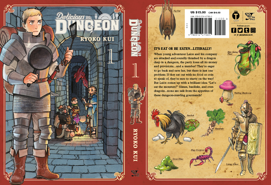
Designing a Delicious Dungeon Logo!
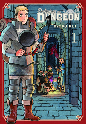
Hello! My name is Andy and I’m a graphic designer here at Yen Press. It’s my pleasure to talk to you today about designing logos, specifically for a new book titled, DELICIOUS IN DUNGEON! This manga follows a small group of adventurers deep inside a dungeon who find themselves without money or food, and rather than giving up—they decide to eat the monsters instead!
 Of course, it’s easy to just make up something cool using an interesting font and incorporating dynamic graphic elements. However, a logo should embody the spirit of the material, describing in a visual language what the book is about. Therefore, designing a successful logo is a process with several steps.
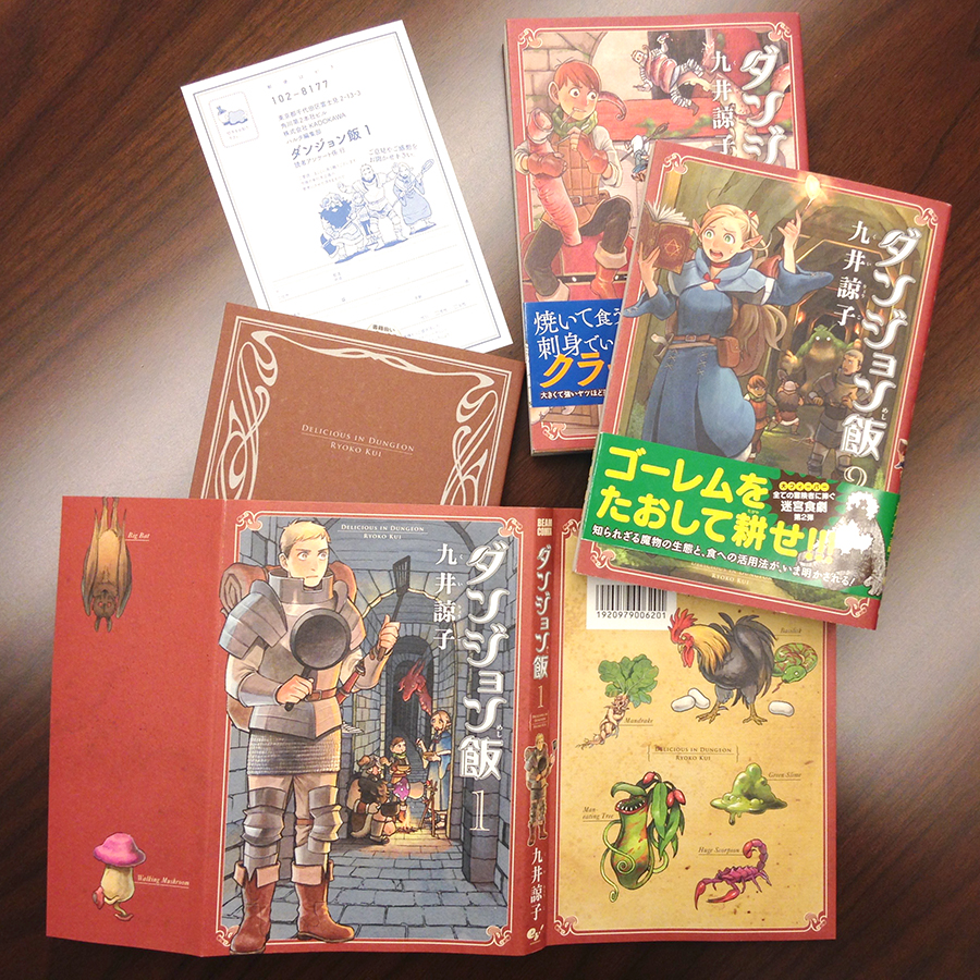
STEP ONE: Get familiar with the series. Before I start anything it’s the editor’s job to provide a brief for the title that includes: a synopsis, a few comparison titles, and a description of the general appearance. For DELICIOUS IN DUNGEON, the editor was looking for options that match the original Japanese logo as well as some that are completely redesigned. Taking everything into consideration, I then examine the source material and note graphic styling and packaging elements of the first couple of books in the series.
Of course, it’s easy to just make up something cool using an interesting font and incorporating dynamic graphic elements. However, a logo should embody the spirit of the material, describing in a visual language what the book is about. Therefore, designing a successful logo is a process with several steps.
STEP ONE: Get familiar with the series. Before I start anything it’s the editor’s job to provide a brief for the title that includes: a synopsis, a few comparison titles, and a description of the general appearance. For DELICIOUS IN DUNGEON, the editor was looking for options that match the original Japanese logo as well as some that are completely redesigned. Taking everything into consideration, I then examine the source material and note graphic styling and packaging elements of the first couple of books in the series.
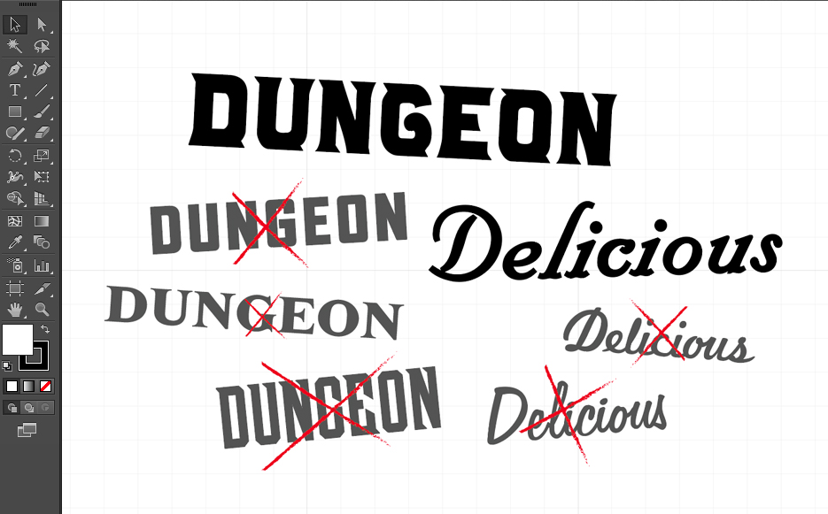
 STEP TWO: Bring on the font parade! Finding a good typeface is a great starting point, and luckily I have access to an extensive collection. Because “dungeon” was in the title, that instantly made me look for something weighty and thick—not unlike the original Japanese logo. After some considerable digging, I found a font that seemed a good match and also had pointed corners that I thought added a sense of danger. My next thought was to find something more decadent for the word “delicious”, and soon found a script that was both playful and weighty enough that it did not to get lost next to my first choice.
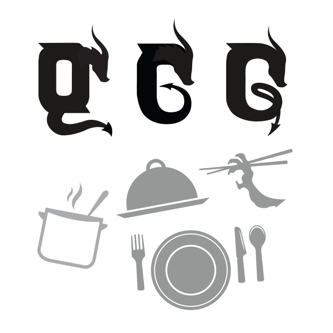
 STEP THREE: Make it your own. There is almost no limit to customization, but I try to have each change supported by a smart choice. The wavy shape of the “l” in “delicious” is meant to mimic the steam or aroma coming from food. It is also not unlike the curved shapes in the original Japanese logo. The “g” in “dungeon” was the perfect opportunity to mimic the curling silhouette of a dragon. To make the connection to food stronger, utensils seemed an obvious choice. Although chopsticks were incorporated in my initial designs, they were replaced with a table setting more recognizable to a Western audience.
 STEP FOUR: Refine and polish. All that’s left really is some fine tuning and to make sure the logo looks good both colored and in black and white. I added a small outline around the text to further mimic the Japan logo and link all the elements together. It’s also important to make sure that the logo reads clearly in different sizes and fits nicely in the narrow area of the spine. Sometimes it’s necessary to reposition letters or words, but not in this case.
 I hope you found my process interesting and enjoy reading the manga.
Bon apétite!
I hope you found my process interesting and enjoy reading the manga.
Bon apétite!
SHARE:

Get the latest news
You will never miss updates if you subscribe to our newsletter.