Menu
Posted Oct 11, 2012 by Supadu Dev
The making of Thermae Romae
 I’m not sure about you, but visiting an onsen with monkeys in Japan has always been one of my dreams! So when I first heard of Thermae Romae, I couldn’t resist picking it up, and it was loads of fun. Not only was it about Japanese baths, but since it was from a foreigner’s point of view, the things that were surprising and exciting for him were similarly exciting for me. It seemed like one of those titles that would enrich Yen’s line, but even so, not having a common bath culture, I wasn’t sure if it would ever work in the American market.
However, it really became a phenomenon in Japan, and when we heard that it was doing so well in the European markets as well, we took another look at the property, and while we were debating at it, we heard that the author currently lives in the States! Somehow, that felt like an omen, and we decided to give it a chance! To make it work in the States, though, we considered several different strategies and, in the end, decided that a prestige omnibus oversized hardcover was the way to go.
Doing it oversized – much bigger than the original Japanese version – was only possible since we were able to get the original digital assets. The quality of the art goes down if something is blown up too much. But since Thermae Romae was already running in the Japanese magazine (which is almost the same size as our book) it meant that the original assets were big enough for us to do an oversized book without compromising the quality at all! That helped us make the final decision on the size.
Working on the book itself was loads of fun. Sometimes I had to stop editing it because I simply couldn’t stop laughing. As for the text, while we always try to be as close and true as possible to the original context, Roman people speaking too much like Japanese people seemed odd to us, so the parts in Rome were more localized, without honorifics, while the Japanese parts were done in a more traditional Yen style. The author’s essays between chapters were awesome reads, and we did our best to make sure the author’s messages were conveyed faithfully. Ah, and while we don’t always do this, since this was an oversized book, we also did a test print to make sure the pages were coming through nice and clean, without any moiré issues or fine lines getting lost.
And then the cover! While I cried and cried that we should print the book on waterproof paper (think about reading a book about baths during an actual bath!) the idea was not even remotely possible, so imagine how happy I was when Wendy came up with the awesome idea of using acetate as the jacket! It’s waterproof, while still giving a bit of a wet (?) illusion, and I thought that was a brilliant idea for this book. And for more about the cover, I’m passing the baton to Wendy!
Overall, it was something a bit out of the norm for us, and we couldn’t be more excited about this book. When it hits stores, I hope you all run and pick it up, enjoying it as much as we all did. And remember, the awesome acetate cover is just for the first print run, so you might want to hurry to make sure you get a copy!!
-JuYoun Lee
••••••••••••••••••••••••••••••••••••••••••••••••••••••••••••••••••••••••••••••••••••••••••••••••••••••••••••••••••
It was super fun last time blogging about the design and editorial process that we decided to come back with a special edition post about a Nov. release book I’m super excited about. Can you guess which? YUP, you guessed it, it’s the hardcover edition of THERMAE ROMAE!
Thermae Romae was a hit in Japan and had received a ton of awards there. So this was a very special title to work on. The editor was happy with keeping the original Japanese design but had said that if I had any other ideas for the cover she would be open to it. Since it was a hardcover book, I wanted the book to be special. So during my commute home I started taking notes and sketching rough ideas in my sketchbook.
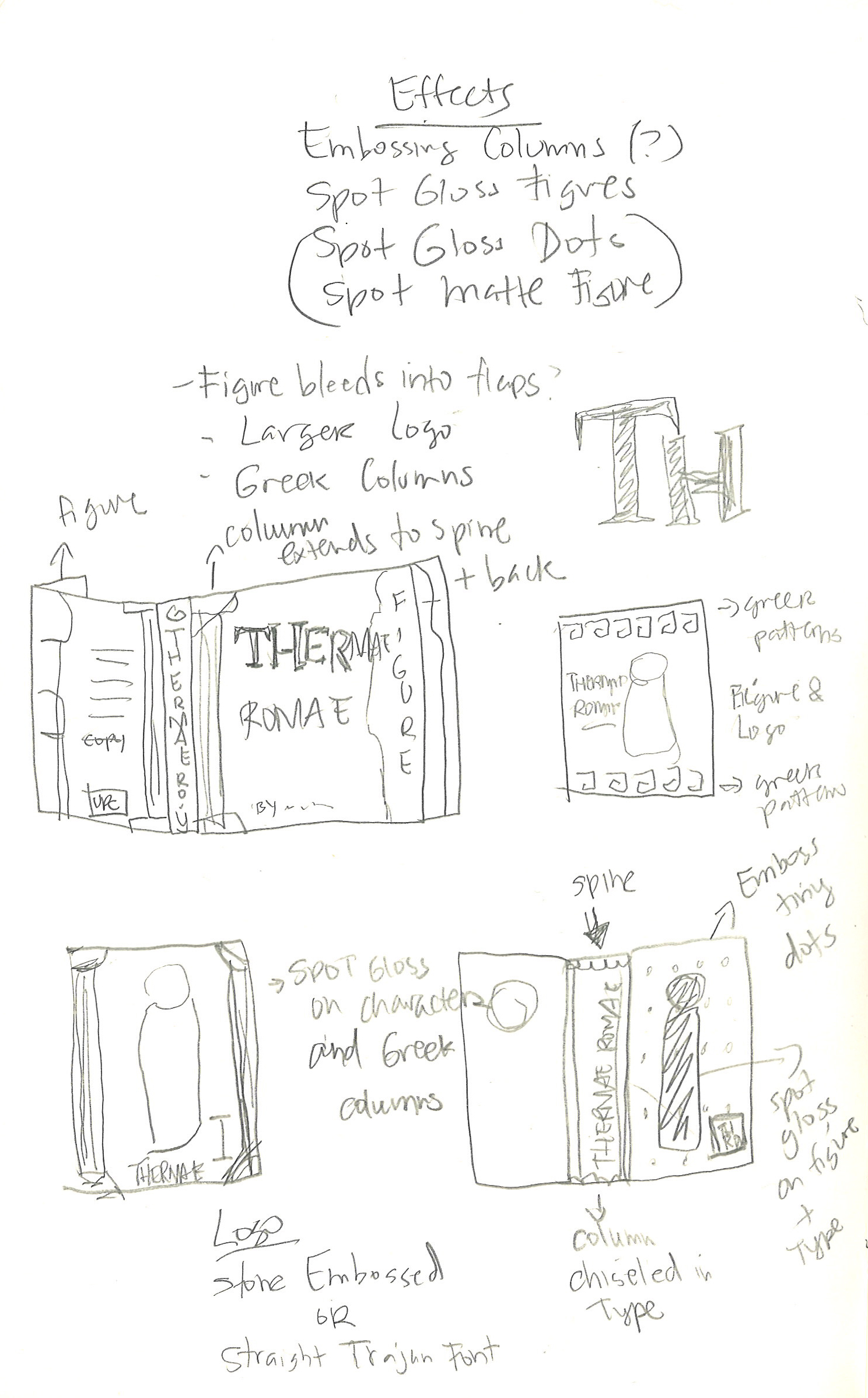 I played with several Roman architecture motifs and applied it to the spine, cover and jacket flaps. These were my initial designs.
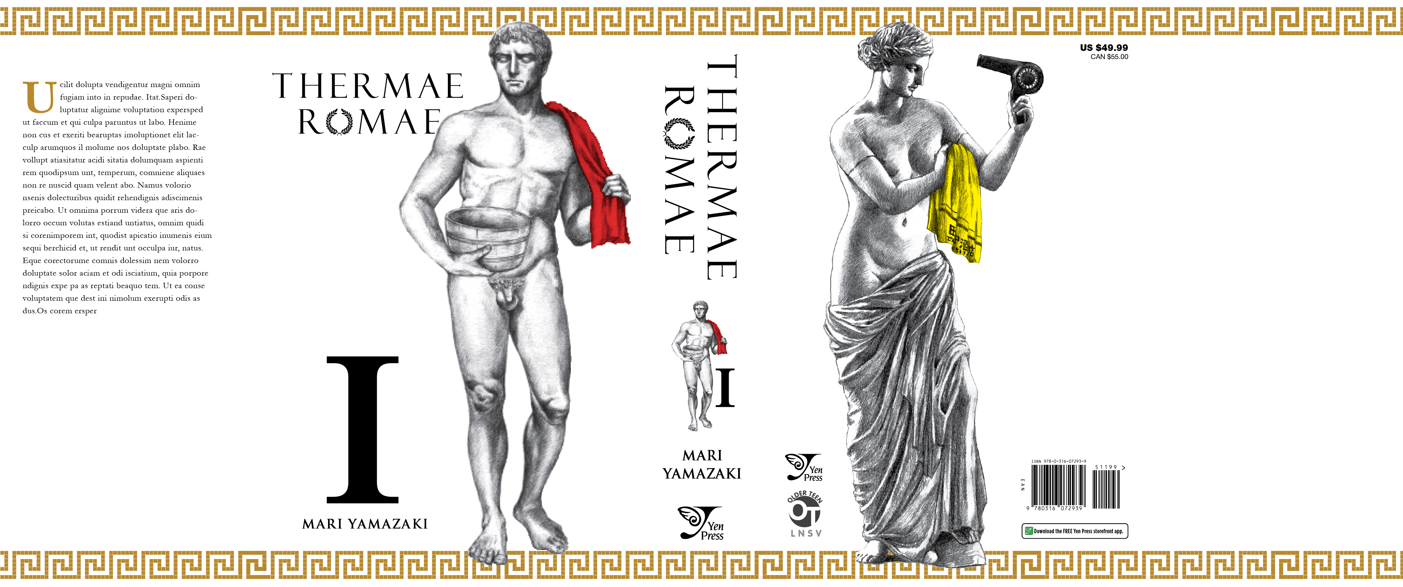
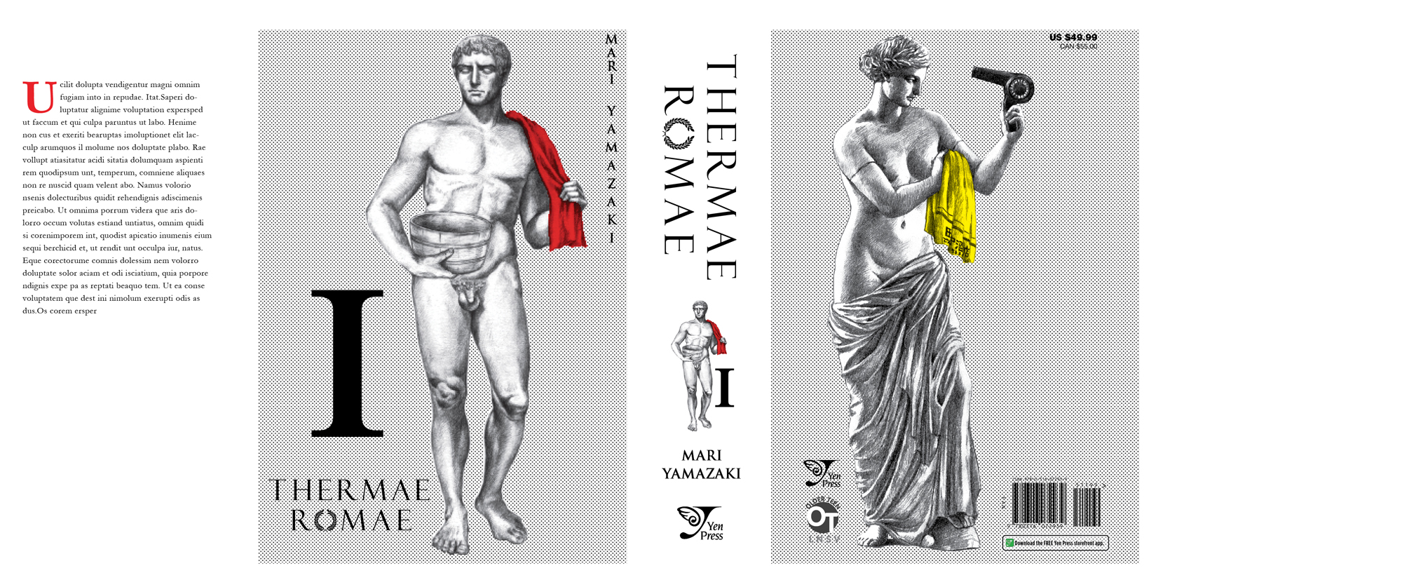
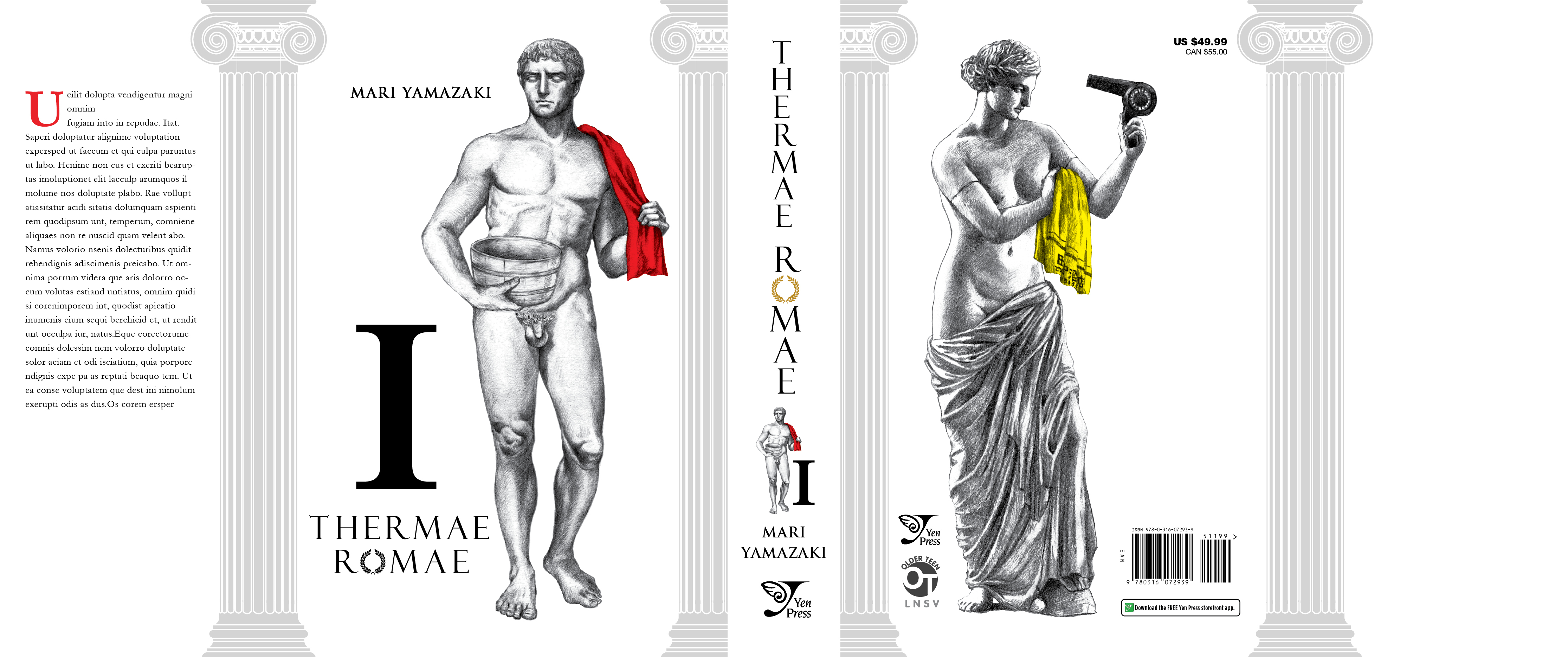 Other than thinking of the imagery and logo design of the book, I also had to consider any special effects that would help make the book stand out as you can see labeled above. The third layout was my favorite but also the one out of the 3 I thought would get nixed first. I had wanted the statue figures on the front and back to be printed on the case of the book and the jacket would be a clear transparent acetate. On that acetate would be the logo and column designs. So when placed together, it would complete the book’s package. I really wanted this to happen so I mocked something up with transparency paper so we could all envision the concept better. And lucky me instead of nixing the idea, they went for it.
Though they liked it, they would also like to see a more detailed idea of which elements would print on the case and the acetate jacket. That way they can price out the cost of producing the book. Initial estimates by our production team were very high and pricey. I left the meeting super excited and immediately got to working. In the midst of finalizing the column design another idea popped in my head. Won’t someone please think of the children?! as Ms.Lovejoy would say. All those nude figures! What if I had the logo printed on the acetate and it would cover up the private parts of the statue? Wouldn’t that utilize the acetate better? The following week I went back to the meeting with 2 refined ideas and together we chose the final cover of Thermae. I’m so excited to finally reveal the cover I’ve been working on for the last 3-4 months.
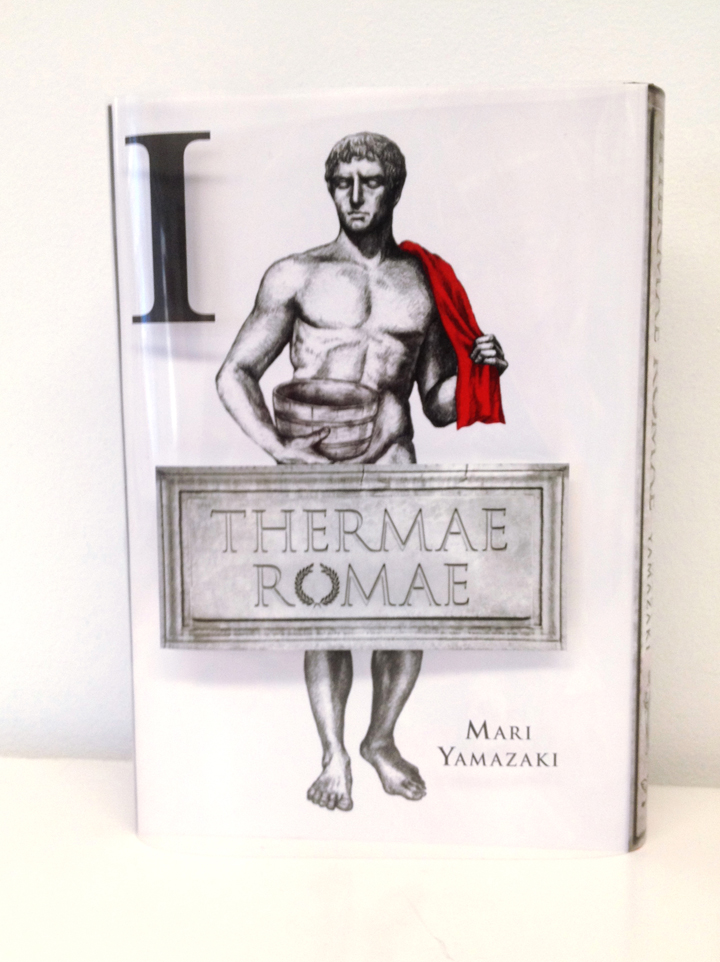
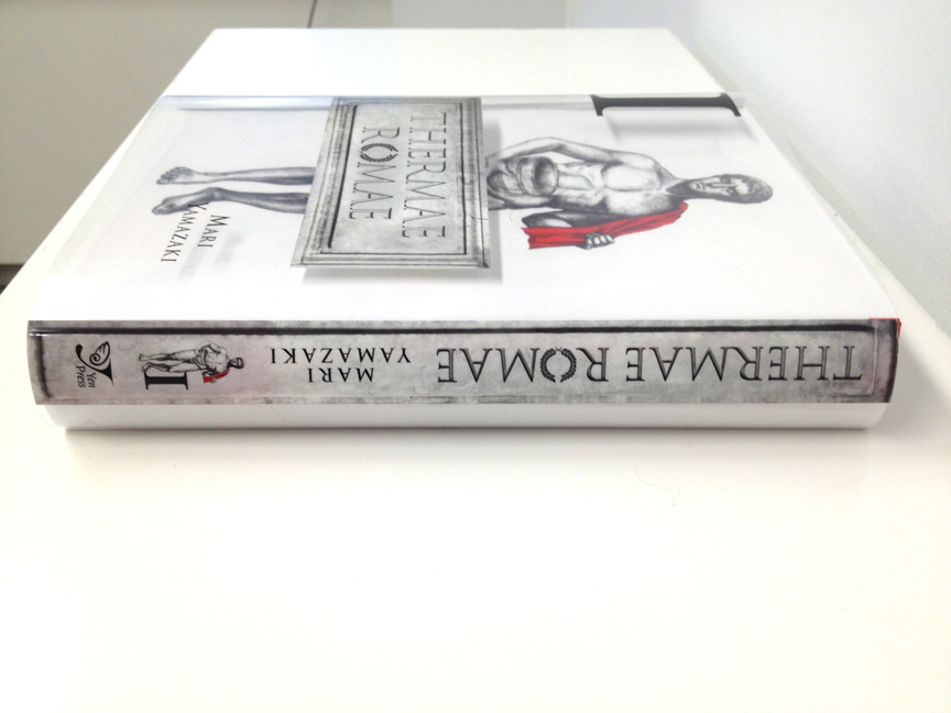
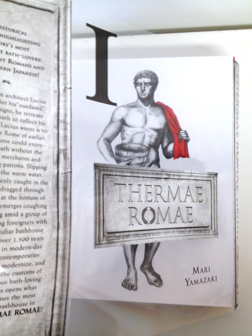 Slowly undressing the book....
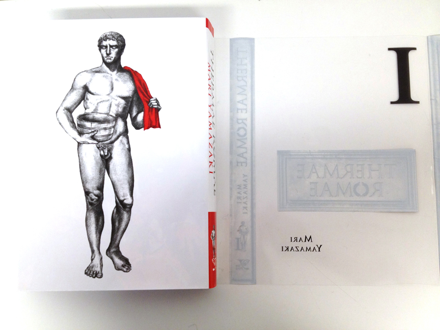 TADA! Underneath the Acetate.
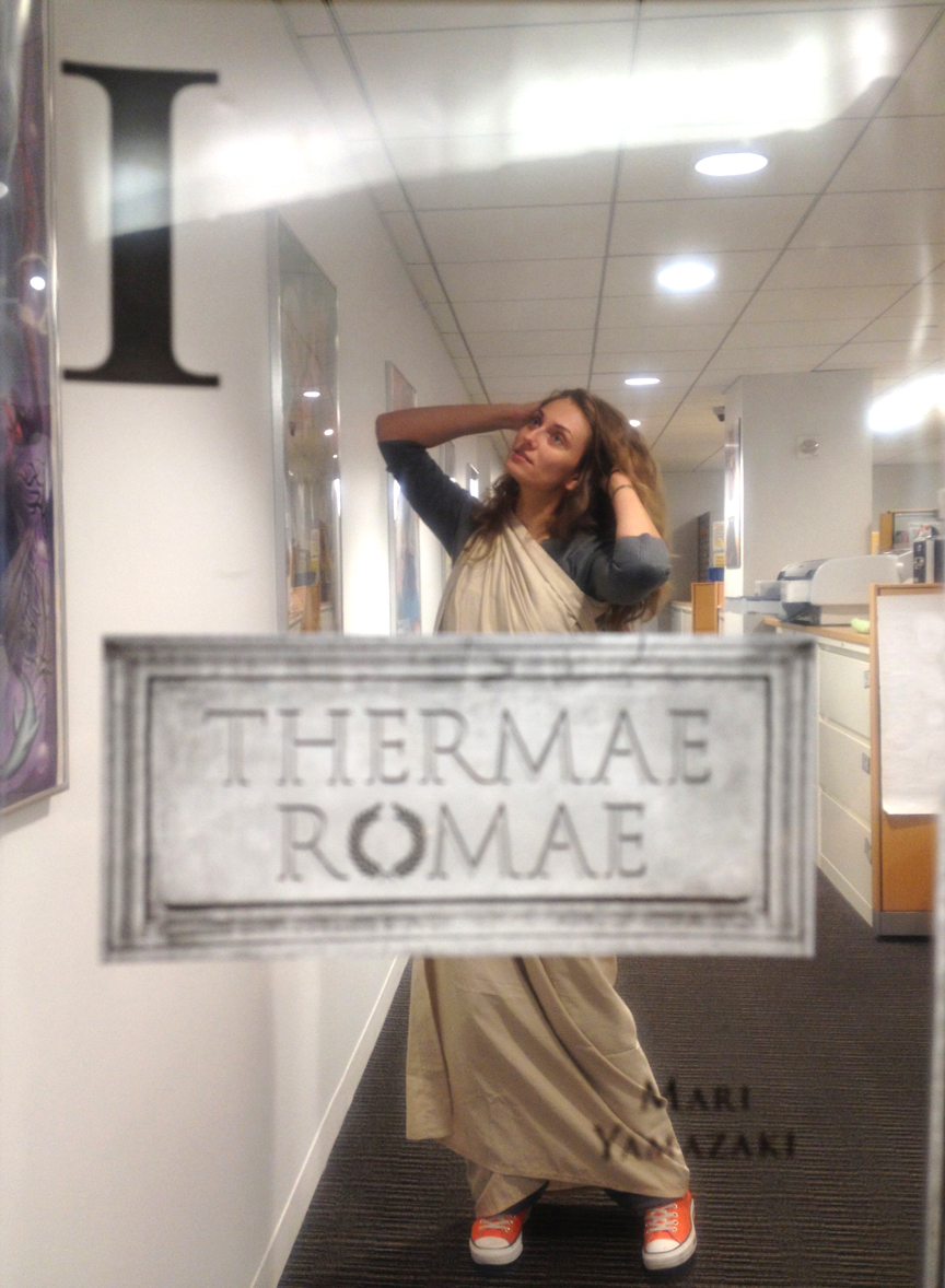 Just imagine the photo possibilities with a clear cover! Here's Abby doing her best to recreate the cover with her homemade toga.
Thank you! Hope you all enjoy this book as much as I enjoyed designing it.
-Wendy Chan


