Menu
Posted Jun 25, 2012 by Supadu Dev
The making of Alice in the Country of Hearts!
The complete Alice in the Country of Hearts is available now in a store near you! Because we are so excited to see the long-awaited finale to Alice's adventures in Wonderland, Wendy and Abby thought they'd share a little bit about the editorial and design processes that went into bringing you these lovely omnibus editions! When we set out to publish Alice in the Country of Hearts, we were able to begin with the text of the first five TokyoPop editions as our starting point. But every manga publisher has a different approach to how they handle translation. When you read a Yen book, we’ve asked our translators to preserve the original language’s meaning as closely as possible while delivering a natural, readable story. The rewriters of the first Alice release did a great job with the dialogue, but we wanted to make sure that the Yen editions of Alice were as doggedly faithful to the original as we try to be with our other series. This adaptation by senior editor JuYoun Lee amounts to general changes throughout, though we tried to preserve the voices of the characters you’ve come to love as much as possible. The most distinctive change you may notice is a general reduction of modern slang in Alice’s speech. She may not fancy herself a lady like her sister, but she is still something of a well-mannered girl, in spite of her lawn naps! Of course, the text is only half of the story! We wanted to make sure the interior of the book looked as good as those covers Wendy put together! We used the original digital art files that were used to print the Japanese editions so that you get pristine image quality at the larger trim size. And how about that larger size, huh? Boris is that much more mischievous, Julius is that much more mysterious, Elliot more adorable, Blood more...deplorable... :P When we start making omnibuses, people fear that we’re going to cut material, but that is absolutely not the case. Each omnibus includes the full-color cover art for each volume and the extra art that appeared under the dust jackets of the Japanese editions, and the third omnibus contains a special color gallery at the back that features nine gorgeous pieces of Alice art from artist Soumei Hoshino! Whether it’s your first time visiting Wonderland or if you’ve leaped down the rabbit-hole before, we hope you will enjoy the Yen Press omnibus editions of Alice in the Country of Hearts! --Abby Blackman ••••••••••••••••••••••••••••••••••••••••••••••••••••••••••••••••••••••••••••••••••••••••••••••••• When I learned that Yen was saving Alice in the Country of Hearts, I was so excited that I couldn’t contain myself. Like many of you I’ve read the first five volumes and was sorely disappointed to learn that I would never see volume 6 in English. But rejoice! There's finally an ending! When our Spring 2012 schedule came out I asked my art director to be put on the Alice project. Lucky me I got it. This was a tricky title because there was already a established “look” for the series since it’s been published in the U.S. before and the fans were familiar with it. I was given two pieces of information from the Editor.
1. Make it Awesome.
2. Make it look like the Japanese logo.
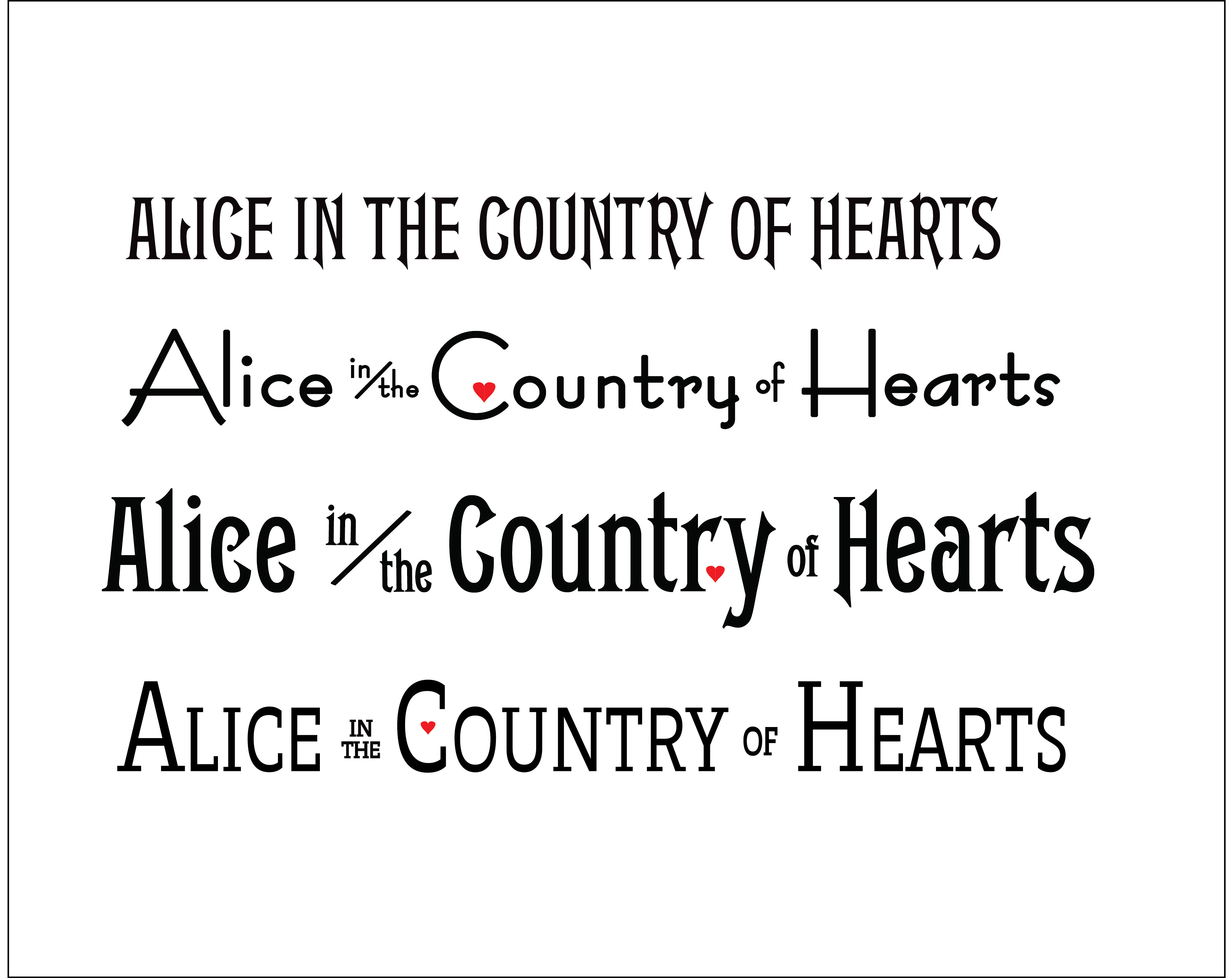
And this is what my first round looked like.
Round 1: FAIL
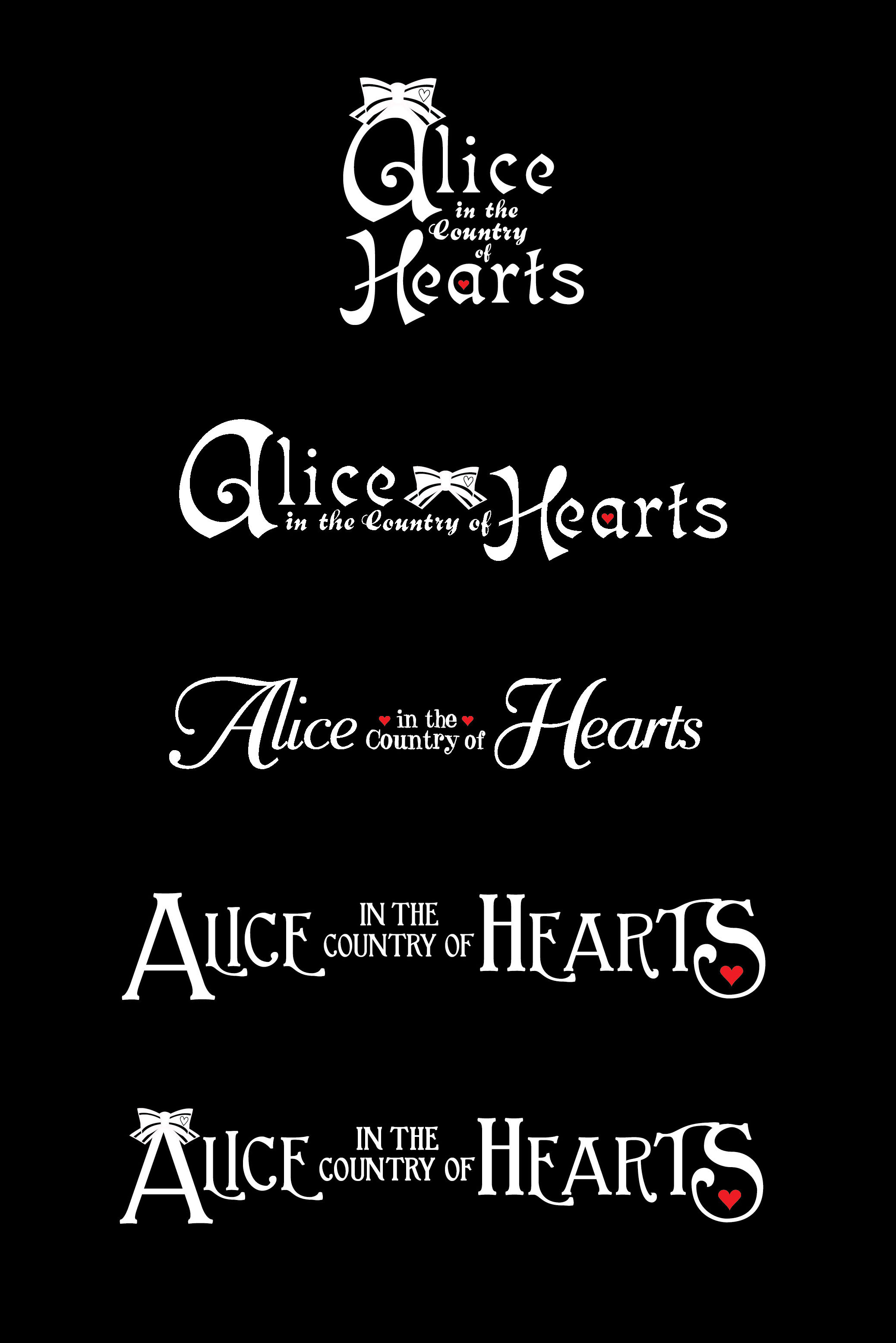
They mimic the thin strokes of the Japanese logo but hardly what you call amazing. It didn’t go over too well in the meeting and they were rejected. So from there, I decided to start from scratch as if there wasn’t a Japanese logo or previous “english” logo to refer to. I tried out several typefaces and played with their placement, sizing and look of each letter. Also added were personal little elements from the story like Alice’s bow and the hearts. In the end the second round turned out much stronger and refined. They also better portrayed the feelings of the story itself.
Round 2: Which one will they choose?
The editorial team took a vote and went with the last one.
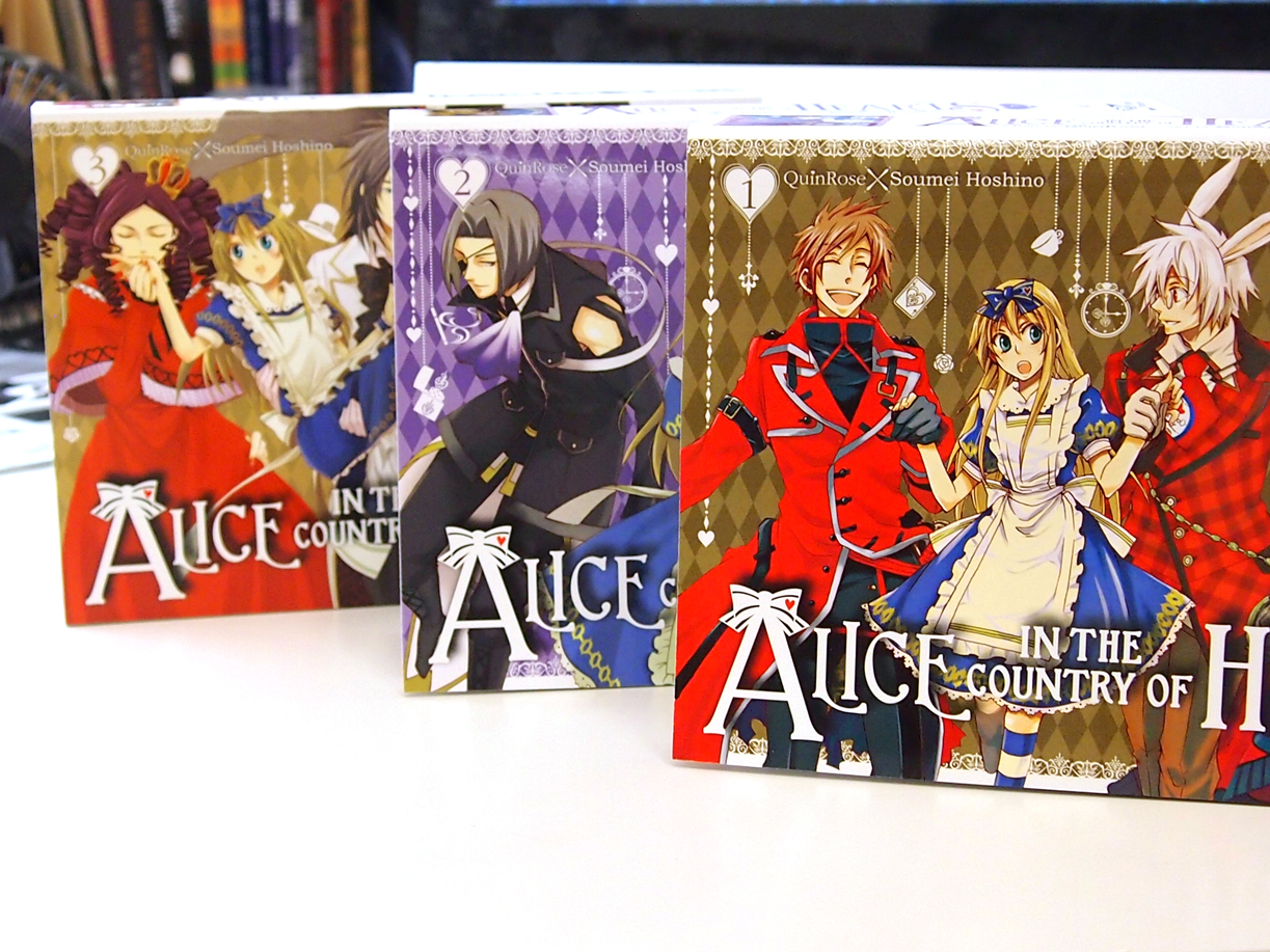
To give more definition to the logo, we decided to use a gloss lamination on the books and spotte matte on the areas that are white. That way there is a texture to the book when you handle it. The spot matte layer was a pain to do. All those little ornaments on the sides of the books and spine are teeny tiny and hard to register. Thankfully they came out pretty good.
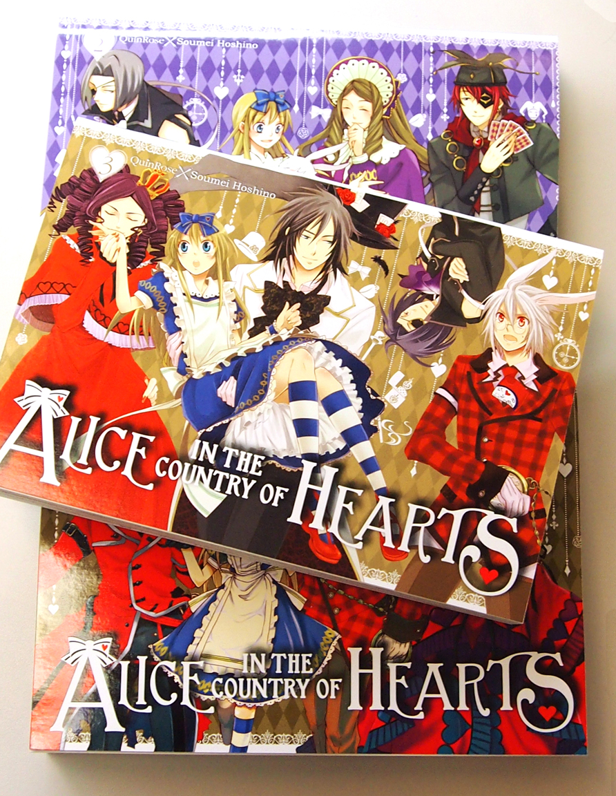 They're so nice you just want to run your hands along the spine constantly to feel the letters! Go ahead, run to your local bookstore just to feel the book up. Or if it makes you feel uncomfortable sitting in the manga section just constantly touching the three amazing omnibuses, buy them and sit them on your bookshelf at home. They’re awfully pretty on a shelf.
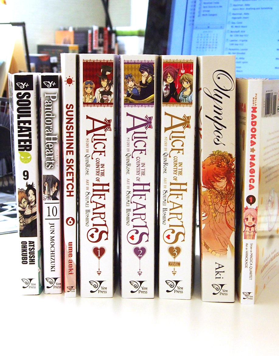 Hope you guys enjoy the Alice omnibuses! I enjoyed working on them!
-Wendy Chan


